


スポンサーリンク

イメージ
コーディング単価
1ページ: 5万円
コード
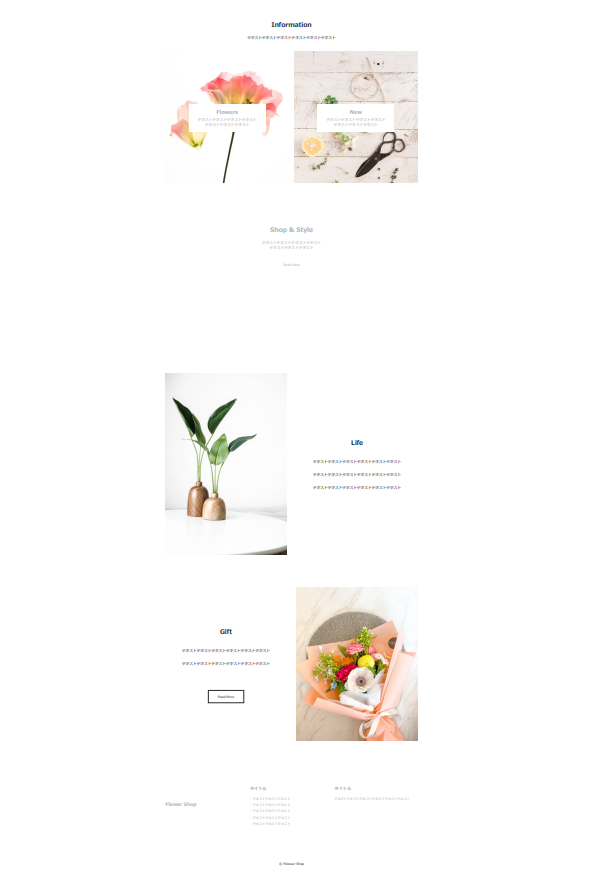
ディレクトリ構成
StoreSiteSample1
 ├ CSS
 │  └ style.css
 ├ img
 │  ├ flower-gift.jpg
 │  ├ flower-shelf.jpg
 │  ├ flower-tool.jpg
 │  ├ flowershop.jpg
 │  ├ green.jpg
 │  └ single-flower.jpg
 └ index.html
HTML(index.html)
<!DOCTYPE html>
<html lang="ja">
<head>
<meta charset="UTF-8">
<meta http-equiv="X-UA-Compatible" content="IE=edge">
<meta name="viewport" content="width=device-width, initial-scale=1.0">
<meta name="discription" content="StoreSite">
<title>Store Site</title>
<link rel="shortcut icon" href="img/single-flower.jpg" type="image/x-icon">
<link rel="stylesheet" href="https://unpkg.com/ress/dist/ress.min.css">
<link rel="stylesheet" href="css/style.css">
</head>
<body>
<header id="header">
<h1 class="site-title">Flower Shop</h1>
</header>
<main>
<section id="information" class="wrapper">
<h2 class="sec-title">Information</h2>
<p>テキストテキストテキストテキストテキストテキスト</p>
<div class="flex-item">
<a class="item" href="#">
<img src="img/single-flower.jpg" alt="">
<div class="text">
<p class="title">Flowers</p>
<p>
テキストテキストテキストテキスト<br>
テキストテキストテキスト
</p>
</div>
</a>
<a class="item" href="#">
<img src="img/flower-tool.jpg" alt="">
<div class="text">
<p class="title">New</p>
<p>
テキストテキストテキストテキスト<br>
テキストテキストテキスト
</p>
</div>
</a>
</div>
</section>
<section id="style">
<div class="wrapper">
<h2 class="sec-title">Shop & Style</h2>
<p>
テキストテキストテキストテキスト<br>
テキストテキストテキスト
</p>
<a href="#" class="btn">Read More</a>
</div>
</section>
<section class="life-gift">
<div class="flex-item wrapper">
<div class="item">
<img src="img/green.jpg" alt="">
</div>
<div class="item">
<h2 class="sec-title">Life</h2>
<p>テキストテキストテキストテキストテキストテキスト</p>
<p>テキストテキストテキストテキストテキストテキスト</p>
<p>テキストテキストテキストテキストテキストテキスト</p>
</div>
</div>
</section>
<section class="life-gift">
<div class="flex-item wrapper">
<div class="item">
<h2 class="sec-title">Gift</h2>
<p>テキストテキストテキストテキストテキストテキスト</p>
<p>テキストテキストテキストテキストテキストテキスト</p>
<a href="#" class="btn">Read More</a>
</div>
<div class="item">
<img src="img/flower-gift.jpg" alt="">
</div>
</div>
</section>
</main>
<footer id="footer">
<div class="flex-item wrapper">
<div class="item">
<h2 class="shop-name">Flower Shop</h2>
</div>
<div class="item">
<p class="title">タイトル</p>
<ul>
<li>テキストテキストテキスト</li>
<li>テキストテキストテキスト</li>
<li>テキストテキストテキスト</li>
<li>テキストテキストテキスト</li>
<li>テキストテキストテキスト</li>
</ul>
</div>
<div class="item">
<p class="title">タイトル</p>
<p>テキストテキストテキストテキストテキストテキスト</p>
</div>
</div>
<p class="copyright">© Folower Shop</p>
</footer>
</body>
</html>CSS(style.css)
@charset "UTF-8";

html {
  font-size: 100%;
}

body {
  font-family: Arial、Hiragino Sans、Hiragino Kaku Gothic ProN、Meiryo、sans-serif;
  font-size: 0.875rem;
  color: #24292e;
}

img {
  max-width: 100%;
}

a {
  text-decoration: none;
}

a:hover {
  opacity: .7;
}

li {
  list-style: none;
}

.wrapper {
  max-width: 1200px;
  padding: 0 5%;
  margin: 0 auto;
}

.sec-title {
  font-size: 1.5rem;
  margin-bottom: 20px;
}

.btn {
  color: #2a2a2a;
  border: 1px solid #2a2a2a;
  display: inline-block;
  font-size: 0.75rem;
  padding: 14px 36px;
  margin-top: 30px;
}

/* header */
#header {
  height: 100vh;
  background-image: url(../img/flowershop.jpg);
  background-size: cover;
  background-position: center;
  background-repeat: no-repeat;
  margin-bottom: 80px;
  position: relative;
}

#header .site-title {
  position: absolute;
  top: 30px;
  left: 30px;
  color: black;
  text-shadow:6px 6px 6px #24292e;
}

/* information */
#information {
  text-align: center;
  margin-bottom: 80px;
}

#information .flex-item {
  display: flex;
  justify-content: space-between;
  gap: 20px;
  margin-top: 40px;
}

#information .flex-item .item {
  width: 50%;
  position: relative;
}

#information img {
  width: 500px;
  height: 500px;
  object-fit: cover;
}

#information .flex-item .item .text {
  max-width: 290px;
  margin: 0 auto;
  position: absolute;
  top: 40%;
  right: 0;
  left: 0;
  color: #ffffff;
  background: #70707080;
  /* background: rgba(0, 0, 0, 0.5); */
  padding: 15px 0;
}

#information .flex-item .item .title {
  font-weight: bold;
  font-size: 1.25rem;
  margin-bottom: 2px;
}

/* style  */
#style {
  height: 500px;
  background-image: url(../img/flower-shelf.jpg);
  background-size: cover;
  background-position: center top;
  background-repeat: no-repeat;
  margin-bottom: 80px;
  padding-top: 60px;
  text-align: center;
}

#style .wrapper {
  background: #70707080;
  color: #ffffff;
  max-width: 600px;
  padding: 15px 0;
}

#style .wrapper .btn {
  color: #ffffff;
  border: 1px solid #ffffff;
}

/* life-gift */
.life-gift {
  background-color: #f5f5f5;
  padding: 60px 0;
}

.life-gift .sec-title {
  margin-bottom: 40px;
}

.life-gift .flex-item {
  display: flex;
  align-items: center;
  justify-content: space-between;
}

.life-gift .item {
  width: 48%;
  text-align: center;
}

.life-gift .item img {
  width: 100%;
}

.life-gift .item p {
  margin-bottom: 30px;
}

.life-gift .item p:last-child {
  margin-bottom: 0;
}

.life-gift .btn {
  margin-top: 60px;
}

/* footer */
#footer {
  background-color: #333333;
  font-size: 0.75rem;
}

#footer .flex-item {
  color: #ffffff;
  display: flex;
  justify-content: space-between;
  padding-top: 100px;
  padding-bottom: 100px;
}

#footer .item {
  width: 33%;
  line-height: 2;
}

#footer .item:first-child {
  padding: 60px 0;
}

#footer .item li::before {
  content: "-";
  margin-right: 5px;
}

#footer .item .title {
  font-size: 1rem;
  font-weight: bold;
  margin-bottom: 10px;
}

#footer .copyright {
  background-color: #ffffff;
  text-align: center;
  padding: 30px 0;
}

/* SP */
@media(max-width: 896px) {
  #header {
    position: relative;
  }

  #header .site-title {
    position: absolute;
    top: 30px;
    left: auto;
    right: 30px;
  }

  #information .flex-item {
    flex-direction: column;
  }

  #information .flex-item .item {
    width: 100%;
  }

  #information .flex-item .item:first-child {
    margin-bottom: 30px;
  }

  #style {
    padding-top: 35px;
    margin-bottom: 50px;
  }

  .life-gift {
    padding: 30px 0;
  }

  .life-gift .flex-item {
    flex-direction: column;
  }

  .life-gift .flex-item .item {
    width: 100%;
  }

  .life-gift .flex-item .item:first-child {
    margin-bottom: 60px;
  }

  #footer .flex-item {
    flex-direction: column;
    padding-top: 30px;
    padding-bottom: 30px;
  }

  #footer .item {
    width: 100%;
    margin-bottom: 30px;
  }

  #footer .item:first-child {
    padding: 0;
    text-align: center;
  }

}

コメント